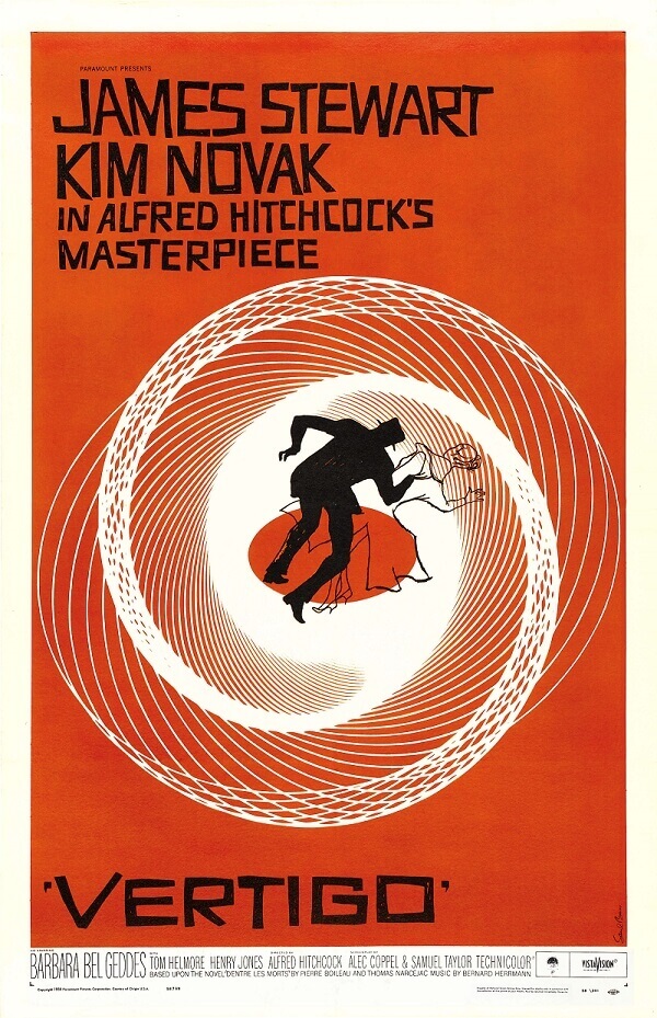
10 Design Principles Every Poster Should Follow
Creating an effective poster requires a blend of creativity and strategic design. Whether you’re promoting an event, advertising a product, or sharing information, following key design principles ensures your poster captures attention and communicates your message clearly. Here are ten essential design principles every poster should follow:
| Principle | Description | Why It Matters |
|---|---|---|
| 1. Clear Hierarchy | Organize information so the most important elements stand out first. | Guides the viewer’s eye and ensures key messages are noticed immediately. |
| 2. Simplicity | Keep the design clean and uncluttered. | Prevents overwhelming the audience and enhances readability. |
| 3. Contrast | Use contrasting colors, sizes, and fonts to differentiate elements. | Helps important information pop and improves visual interest. |
| 4. Balance | Distribute visual weight evenly across the poster. | Creates harmony and makes the design aesthetically pleasing. |
| 5. Alignment | Align text and images to create a cohesive structure. | Improves readability and gives the poster a professional look. |
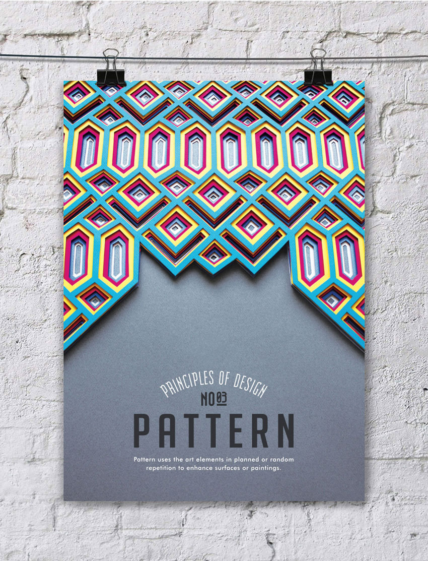
| 6. Repetition | Repeat design elements like colors, fonts, or shapes to create unity. | Reinforces the theme and makes the design more memorable. |
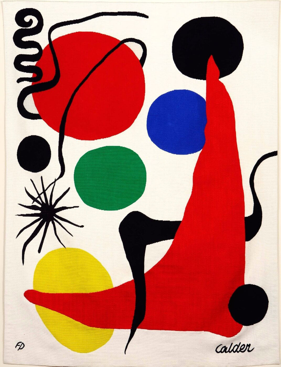
| 7. Color Theory | Choose colors that evoke the right emotions and complement each other. | Enhances mood and attracts the target audience effectively. |
| 8. Typography | Select fonts that are legible and appropriate for the message. | Ensures the text is easy to read and supports the poster’s tone. |
| 9. White Space | Use empty space strategically to avoid clutter. | Allows the design to breathe and highlights key elements. |
| 10. Call to Action | Include a clear and compelling call to action (CTA). | Encourages the audience to take the desired next step, such as attending or purchasing. |
Additional Tips for Poster Design
- Use High-Quality Images: Blurry or pixelated images can detract from your message.
- Limit Fonts: Stick to two or three fonts to maintain consistency.
- Test Readability: View your poster from a distance to ensure text is legible.
FAQ
Q1: How large should my poster be?
A: Poster sizes vary depending on the venue and purpose, but common sizes include 24×36 inches for events and 11×17 inches for smaller promotions.
Q2: Can I use multiple colors in my poster?
A: Yes, but use a harmonious color palette to avoid visual chaos. Tools like Adobe Color can help.
Q3: What software is best for designing posters?
A: Popular options include Adobe Illustrator, Photoshop, Canva, and InDesign.
Q4: How much text is too much?
A: Keep text concise; posters are visual tools, so focus on key points and use bullet lists when possible.
Q5: Should I include contact information?
A: Yes, if relevant, include clear contact details or social media handles.
By adhering to these design principles, your poster will not only look professional but also effectively communicate your message and engage your audience.