7 Common Brochure Design Mistakes to Avoid
Creating an effective brochure is essential for capturing your audience’s attention and conveying your message clearly. However, many designers fall into common pitfalls that can undermine the impact of their brochures. Here, we explore seven frequent brochure design mistakes and how to avoid them.
| Mistake | Description | How to Avoid It |
|---|---|---|
| 1. Overcrowded Layout | Including too much information or too many images, making the brochure cluttered and hard to read. | Use white space strategically to create balance and focus on key messages. |
| 2. Poor Typography Choices | Using fonts that are hard to read or inconsistent font styles that confuse the reader. | Select clear, legible fonts and maintain consistency throughout the brochure. |
| 3. Low-Quality Images | Incorporating pixelated or irrelevant images that reduce professionalism. | Use high-resolution, relevant images that support the content. |
| 4. Ignoring Brand Identity | Failing to align the brochure design with the company’s branding elements like colors, logos, and tone. | Ensure brand consistency to build recognition and trust. |
| 5. Lack of Clear Call to Action (CTA) | Not guiding the reader on what to do next, leading to missed opportunities. | Include a prominent, compelling CTA that directs the reader effectively. |
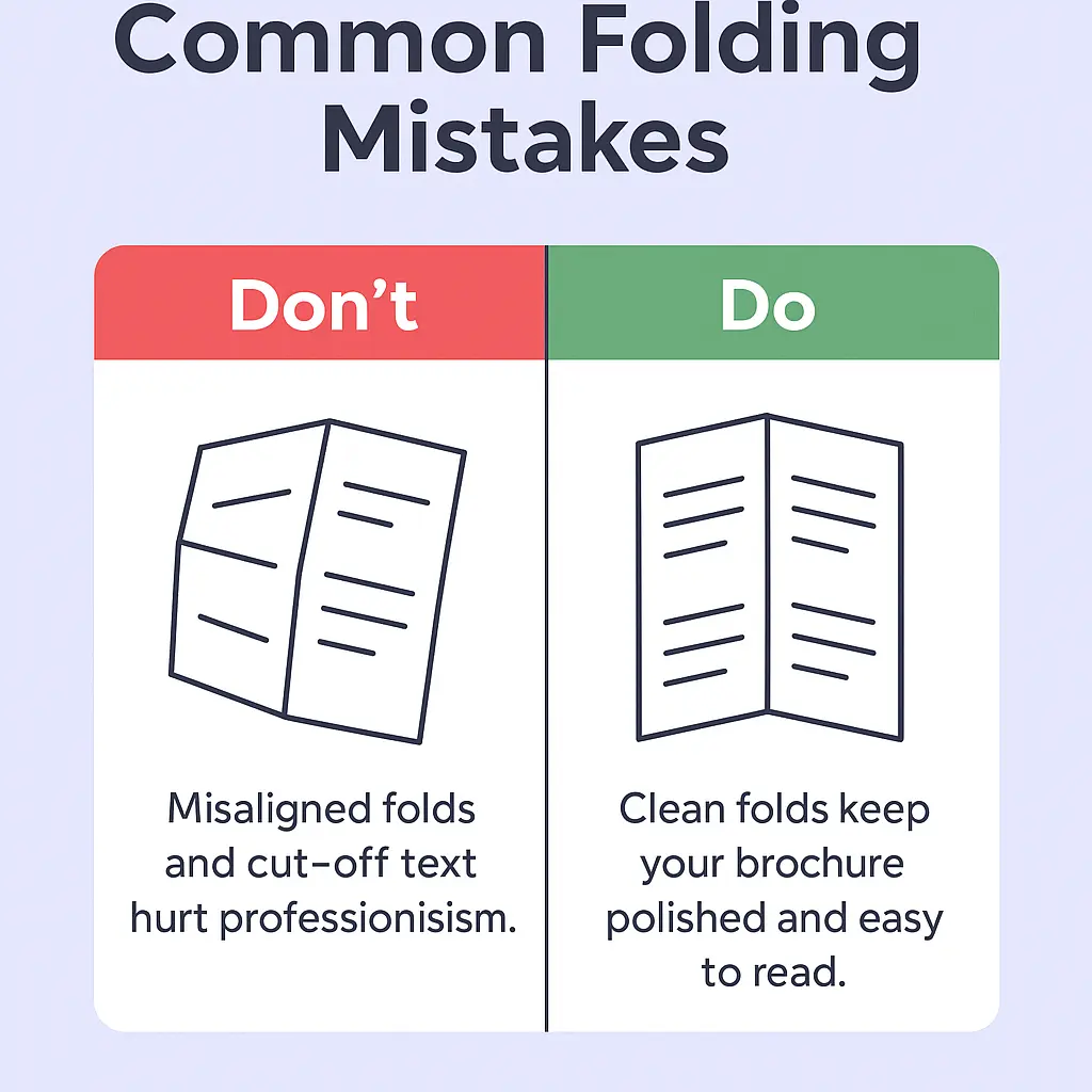
| 6. Neglecting Print Specifications | Overlooking bleed, margins, and color modes, resulting in printing errors. | Follow printer guidelines carefully to ensure quality output. |
| 7. Overuse of Jargon | Using complex language that alienates or confuses the target audience. | Use simple, clear language tailored to your audience’s understanding. |
Additional Tips for Effective Brochure Design
- Consistency is Key: Maintain uniformity in colors, fonts, and style.
- Focus on Benefits: Highlight how your product or service solves problems.
- Use Visual Hierarchy: Guide readers’ eyes through the brochure with size and placement.
Frequently Asked Questions (FAQ)
Q1: How many fonts should I use in a brochure?
A1: Ideally, limit yourself to two or three complementary fonts to keep the design cohesive.
Q2: What is the best paper type for brochures?
A2: Glossy or matte finish paper with a weight of 150-250 gsm is commonly preferred for a professional look.
Q3: How can I make my brochure stand out?
A3: Use unique folds, high-quality images, and a strong CTA to capture attention.
Q4: Should I design brochures for digital use differently?
A4: Yes, digital brochures should be optimized for screen viewing with clickable links and smaller file sizes.
By avoiding these common mistakes and following best practices, your brochure can effectively communicate your message and engage your audience. Remember, a well-designed brochure is a powerful marketing tool that reflects your brand’s professionalism and values.