Choosing the Right Colors for Poster Design
Selecting the perfect colors for your poster design is crucial to capturing attention, conveying the right message, and evoking the desired emotions. This article explores how to choose colors effectively, considering color theory, psychology, and practical design tips.
Understanding Color Theory
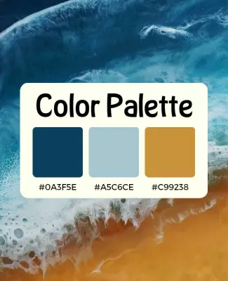
Color theory is the foundation of effective color use in design. It involves the color wheel, which organizes colors into primary, secondary, and tertiary groups. Understanding relationships such as complementary, analogous, and triadic colors helps create harmonious and visually appealing designs.
| Color Relationship | Description | Example |
|---|---|---|
| Complementary | Colors opposite each other on the wheel, creating high contrast and vibrancy | Blue and Orange |
| Analogous | Colors next to each other, offering harmony and subtle contrast | Blue, Blue-Green, Green |
| Triadic | Three colors evenly spaced, providing balanced and dynamic palettes | Red, Yellow, Blue |
The Psychology of Colors
Colors evoke emotions and influence perceptions. For example:
- Red: Energy, urgency, passion
- Blue: Trust, calm, professionalism
- Yellow: Optimism, warmth, attention
- Green: Growth, health, tranquility
- Black: Sophistication, power, elegance
Choosing colors aligned with your poster’s message enhances its impact.
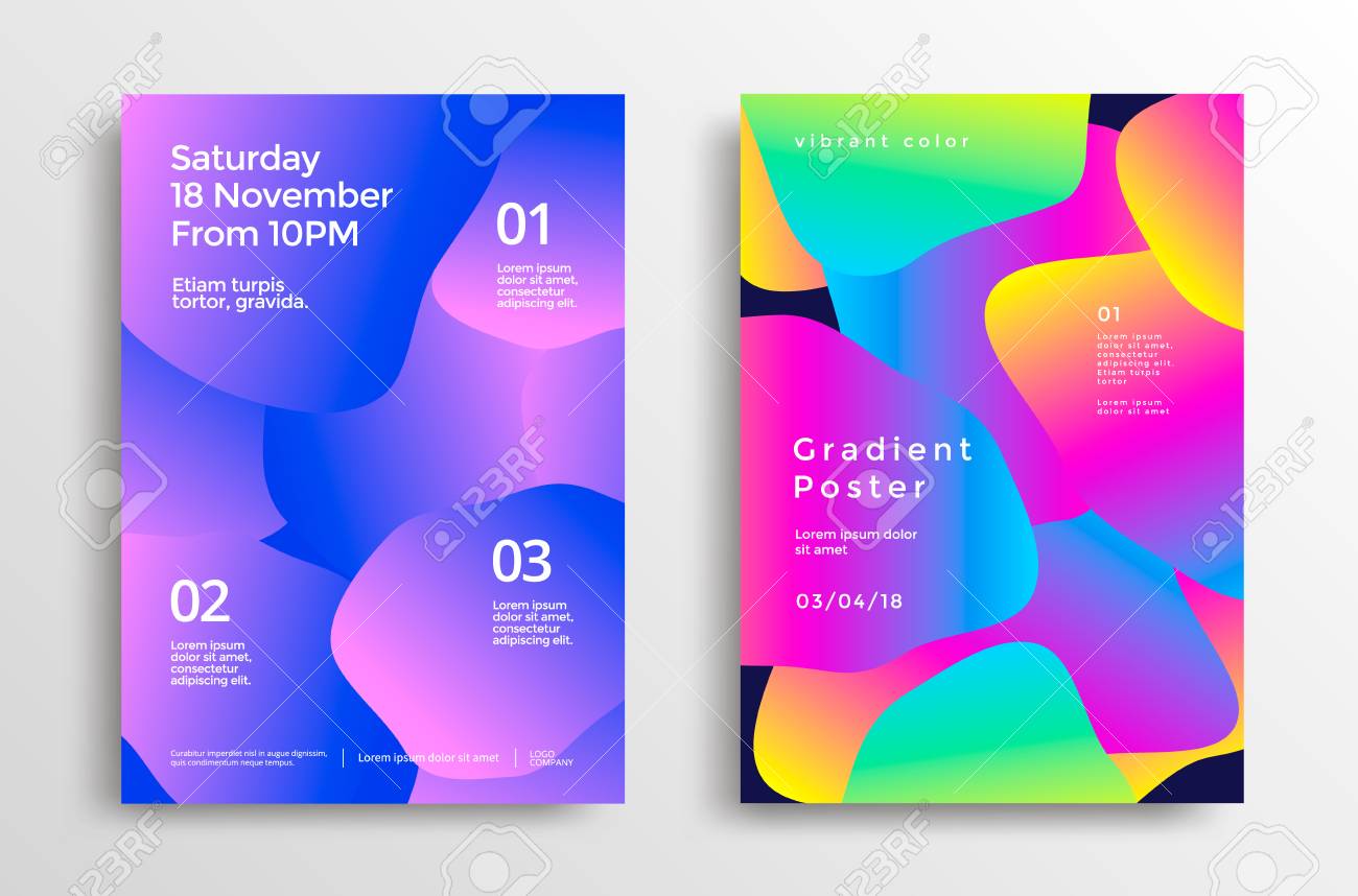
Practical Tips for Choosing Colors
- Consider Your Audience: Different demographics respond uniquely to colors.
- Match the Theme: Align colors with the poster’s purpose and content.
- Use Contrast Wisely: Ensure readability by contrasting text and background.
- Limit Your Palette: Stick to 2-4 main colors to avoid overwhelming viewers.
- Test in Different Lights: Colors can appear differently under various lighting conditions.
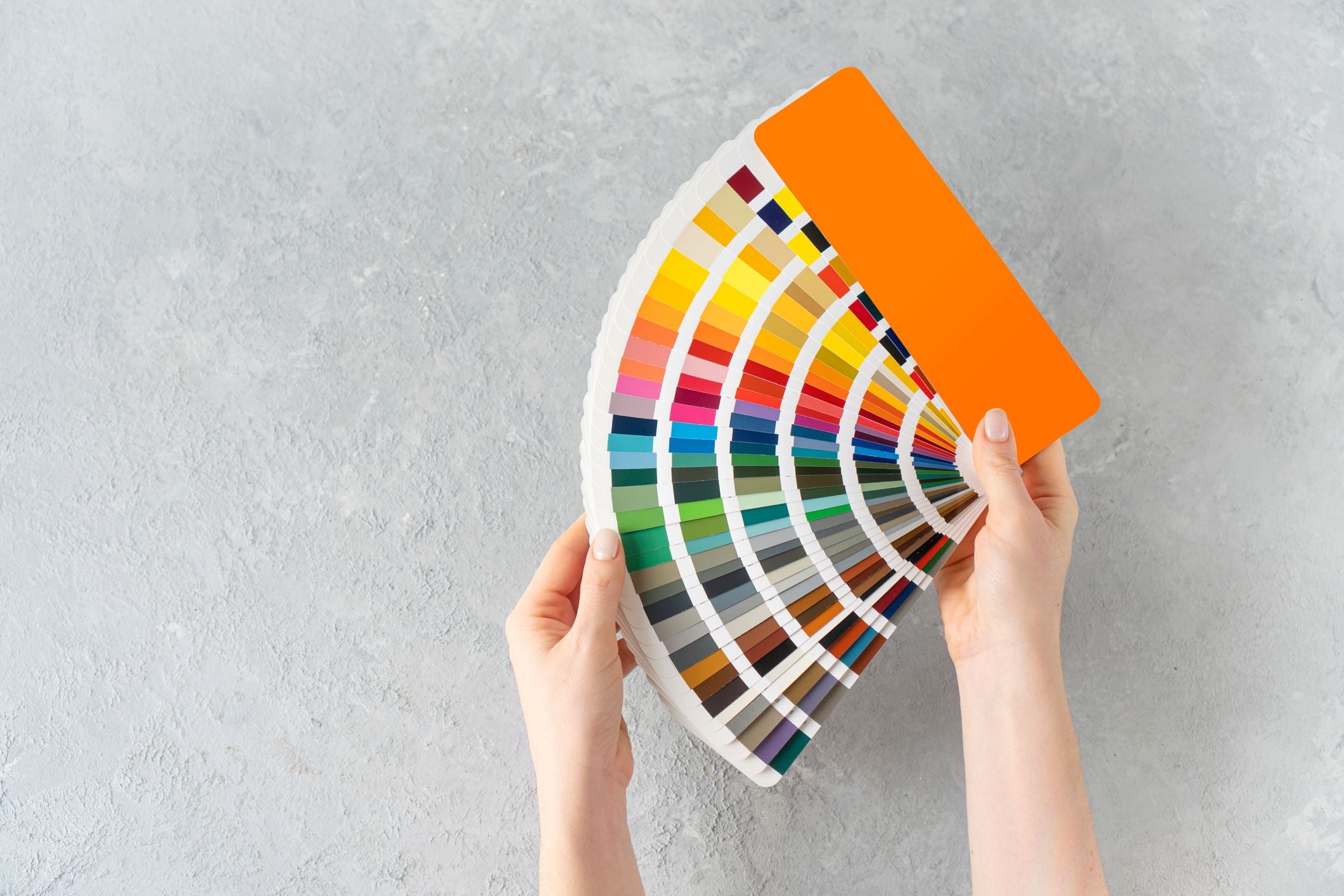
Tools and Resources
- Adobe Color Wheel: For creating harmonious palettes.
- Coolors.co: Quick palette generation.
- Color Hunt: Inspiration from trending palettes.
FAQ
Q1: How many colors should I use in a poster?
A: Ideally, 2 to 4 colors to maintain clarity and focus.
Q2: Can I use bright colors for professional posters?
A: Yes, but balance them with neutral tones to keep professionalism.
Q3: How do I ensure color accessibility?
A: Use tools like contrast checkers to make sure text is readable for all.
Choosing the right colors for your poster design is both an art and a science. By understanding color theory, considering psychological effects, and applying practical tips, you can create compelling posters that communicate effectively and attract your target audience.