
Common Business Card Printing Mistakes to Avoid
Creating an effective business card is crucial for making a lasting impression. However, many people unknowingly make mistakes during the printing process that can undermine their professionalism and brand image. This article explores common business card printing errors and offers practical tips to avoid them.
1. Using Low-Resolution Images
One of the most frequent mistakes is using images or logos with low resolution. This results in blurry or pixelated prints that look unprofessional.
| Issue | Impact | Solution |
|---|---|---|
| Low-resolution logo | Blurry, unclear branding | Use vector files or 300 dpi+ images |
| Poor image quality | Fuzzy photos or graphics | Source high-quality images |
Tip: Always check the image resolution before sending files to print.
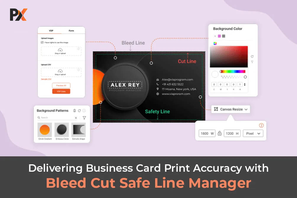
2. Ignoring Bleed and Safe Zones
Failing to include bleed areas or ignoring safe zones can cause important text or graphics to be cut off during trimming.
- Bleed: Extra space (usually 1/8 inch) beyond the card’s edge to ensure color extends to the edge.
- Safe Zone: Margin inside the card where all critical information should be placed.
Avoid: Placing logos or text too close to the edge.
3. Choosing Inappropriate Fonts
Fonts that are too small, overly decorative, or hard to read can make your card ineffective.
- Use clean, professional fonts.
- Ensure font size is at least 8-10 points.
- Avoid script or novelty fonts for contact details.
4. Overcrowding the Design
Trying to fit too much information or too many design elements can overwhelm the recipient.
- Stick to essential information: name, title, company, phone, email, website.
- Use white space strategically to enhance readability.
5. Neglecting Color Accuracy
Colors may appear differently on screen versus print. Ignoring this can lead to unexpected results.
- Use CMYK color mode for printing.
- Request a printed proof before finalizing.
6. Skimping on Paper Quality
Cheap paper can make your card feel flimsy and cheap, damaging your brand perception.
- Choose thicker cardstock (14-16 pt or higher).
- Consider finishes like matte, glossy, or textured for a premium feel.
7. Not Proofreading Thoroughly
Typos and incorrect contact details can ruin your credibility.
- Double-check all text.
- Have someone else review the card.
FAQ
Q1: What is the ideal size for a business card?
A: The standard size is 3.5 x 2 inches, but sizes can vary depending on style and region.
Q2: Should I include a photo on my business card?
A: Only if it aligns with your brand and industry. Photos can personalize your card but may not be suitable for all professions.
Q3: How many colors should I use?
A: Limit colors to 2-3 to maintain a clean and professional look.
Q4: Can I print business cards at home?
A: While possible, professional printing services usually offer better quality and consistency.
By avoiding these common mistakes, you can create a business card that effectively represents your brand and leaves a positive impression. Remember, your business card is often the first tangible interaction with potential clients—make it count!