How to Use Minimalism in Poster Design
Minimalism in poster design is a powerful approach that emphasizes simplicity and clarity, allowing the message to stand out without unnecessary distractions. This article explores how to effectively use minimalism to create visually appealing and impactful posters.
What is Minimalism in Poster Design?

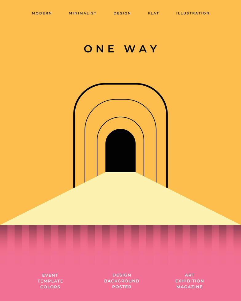
Minimalism is a design philosophy that focuses on using the fewest elements necessary to convey a message. It involves clean lines, ample white space, limited color palettes, and simple typography.
Key Principles of Minimalist Poster Design
| Principle | Description |
|---|---|
| Simplicity | Use only essential elements to avoid clutter. |
| Focus | Highlight the main message or image to draw attention. |
| Balance | Arrange elements harmoniously to create visual stability. |
| Contrast | Use contrasting colors or sizes to emphasize important parts. |
| White Space | Incorporate empty space to enhance readability and focus. |
Steps to Create a Minimalist Poster
- Define Your Message: Clearly identify the core message you want to communicate.
- Choose a Limited Color Palette: Stick to 2-3 colors that complement each other.
- Select Simple Typography: Use clean, readable fonts without excessive decoration.
- Use White Space Effectively: Avoid overcrowding by spacing elements thoughtfully.
- Incorporate a Focal Point: Use size, color, or placement to highlight the main element.
- Eliminate Unnecessary Details: Remove anything that doesn’t support the message.
Benefits of Minimalism in Poster Design
- Enhanced Clarity: The message is easy to understand at a glance.
- Visual Appeal: Clean designs are aesthetically pleasing and modern.
- Improved Focus: Viewers are drawn to the key elements without distraction.
- Versatility: Works well across different media and sizes.
Common Mistakes to Avoid
- Overloading the poster with too many elements.
- Using too many colors or fonts.
- Neglecting white space.
- Failing to create a clear focal point.
FAQ
Q1: Can minimalism work for all types of posters?
A1: While minimalism is versatile, it works best for posters that require clear communication and strong visual impact, such as event promotions or informational posters.
Q2: How do I choose the right colors for a minimalist poster?
A2: Opt for a limited palette with high contrast to ensure readability and visual interest.
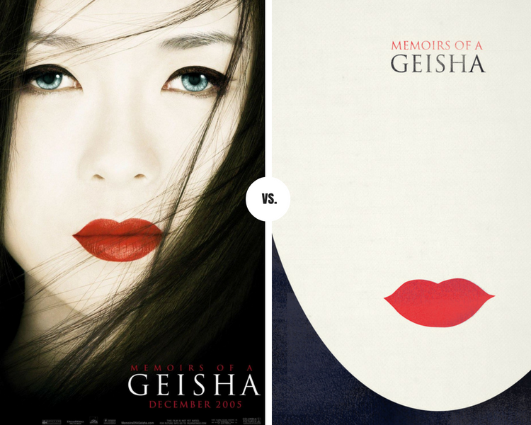
Q3: Is it okay to use images in minimalist posters?
A3: Yes, but images should be simple, high-quality, and support the overall message without cluttering the design.
By applying these principles and steps, you can create minimalist posters that are not only visually striking but also effectively communicate your message with elegance and simplicity.