Pantone Colors Explained: The Ultimate Guide
Pantone colors are a standardized color matching system widely used in various industries such as graphic design, fashion, printing, and manufacturing. This guide will explore what Pantone colors are, why they matter, and how to use them effectively.
What Are Pantone Colors?

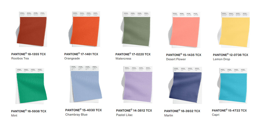
Pantone colors come from the Pantone Matching System (PMS), a proprietary color space used to ensure color consistency across different materials and production processes. Each Pantone color is identified by a unique number, making it easy to communicate exact shades without ambiguity.
Why Are Pantone Colors Important?
- Color Consistency: Pantone colors guarantee that a specific shade looks the same regardless of where or how it is produced.
- Brand Identity: Many companies use Pantone colors to maintain their brand’s visual identity.
- Industry Standard: Pantone is recognized globally, making it a universal language for color.
How to Use Pantone Colors
- Selecting Colors: Use Pantone color guides or digital tools to choose the perfect shade.
- Communicating Colors: Share Pantone numbers with printers, designers, and manufacturers to ensure accuracy.
- Matching Colors: Use Pantone swatches to compare and match colors in physical samples.
Pantone Color Guides and Tools
| Guide Type | Description | Use Case |
|---|---|---|
| Formula Guide | Shows solid colors with mixing formulas | Printing and design |
| Color Bridge Guide | Displays Pantone colors alongside CMYK values | For digital and print matching |
| Pastels & Neons | Special colors with unique hues | Creative and vibrant projects |
Frequently Asked Questions (FAQ)
Q: Can Pantone colors be used in digital design?
A: Yes, Pantone provides digital color libraries compatible with design software like Adobe Photoshop and Illustrator.
Q: How do Pantone colors differ from RGB or CMYK?
A: Pantone colors are spot colors with precise formulations, while RGB and CMYK are color models used for screens and printing, respectively.
Q: Are Pantone colors expensive to use?
A: Using Pantone spot colors can be more costly than standard CMYK printing but offers superior color accuracy.
This guide aims to provide a clear understanding of Pantone colors and their practical applications. Whether you’re a designer, printer, or brand manager, mastering Pantone colors can elevate your work and ensure consistent, vibrant results.