The Importance of White Space in Brochure Design
White space, often referred to as negative space, is the unmarked area between design elements in a brochure. It plays a crucial role in creating an effective and visually appealing brochure. This article explores why white space is essential in brochure design and how it can be strategically used to improve readability, focus, and overall aesthetics.
What is White Space?
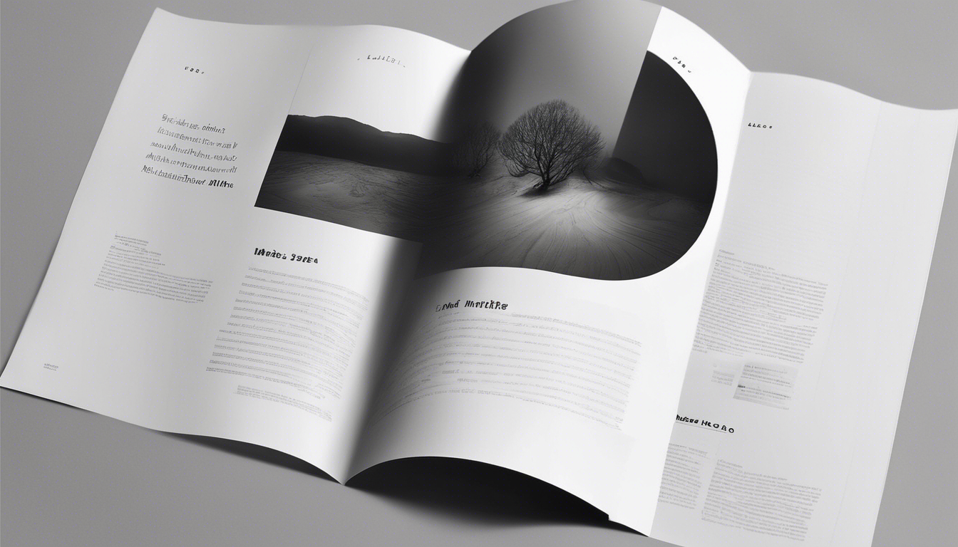
White space is the empty space around text, images, and other elements in a design. It is not merely “blank” space but a vital component that helps organize content and guide the reader’s eye.
Why White Space Matters in Brochure Design
| Benefit | Explanation |
|---|---|
| Enhances Readability | White space prevents overcrowding, making text easier to read and comprehend. |
| Improves Focus | It directs attention to key messages and important visuals by isolating them from clutter. |
| Creates Balance | White space balances design elements, providing a harmonious and professional look. |
| Increases Engagement | A clean layout with ample white space encourages readers to spend more time with the brochure. |
Types of White Space
- Active White Space: Intentionally used to separate elements and create structure.
- Passive White Space: Naturally occurring gaps that result from the layout and content.
How to Use White Space Effectively
- Prioritize Content: Use white space to highlight the most important information.
- Group Related Items: Separate different sections with white space to improve organization.
- Use Margins and Padding: Ensure there is enough breathing room around text and images.
- Limit Clutter: Avoid overcrowding by balancing text and visuals with empty space.
Common Mistakes to Avoid
- Overusing white space, which can make the brochure look sparse.
- Neglecting white space, leading to a cluttered and overwhelming design.
- Ignoring the balance between text and images.
FAQ
Q1: Does white space increase printing costs?
A1: No, white space actually reduces ink usage, potentially lowering printing costs.
Q2: Can white space be colored or patterned?
A2: Yes, white space doesn’t have to be white; it can be any color or pattern as long as it maintains clarity and separation.
Q3: How much white space should a brochure have?
A3: There is no fixed amount; it depends on the design goals, but sufficient white space to avoid clutter is essential.
Conclusion
White space is a powerful design tool that enhances the effectiveness of brochures by improving readability, focus, and aesthetic appeal. Thoughtful use of white space can transform a cluttered brochure into a compelling marketing piece that captures and retains the audience’s attention.