The Psychology of Typography in Poster Design
Typography is more than just choosing a font; it’s a powerful tool that influences how viewers perceive and interact with a poster. Understanding the psychology behind typography can elevate poster design by enhancing communication, evoking emotions, and guiding the viewer’s attention.
Why Typography Matters in Poster Design
Typography affects readability, mood, and the overall effectiveness of a poster. The right typeface can convey professionalism, creativity, urgency, or calmness, shaping the viewer’s emotional response and engagement.
| Aspect | Psychological Impact | Design Consideration |
|---|---|---|
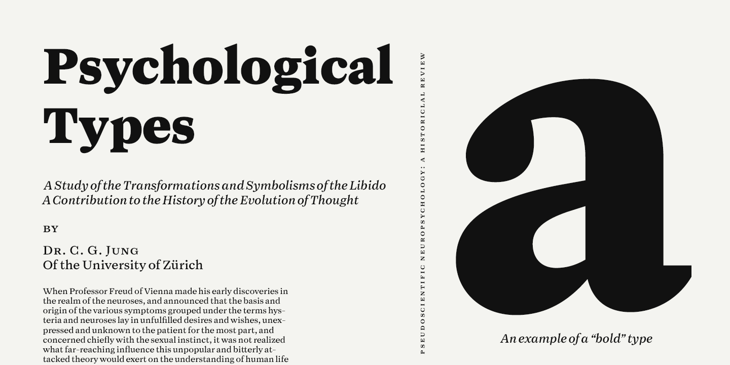
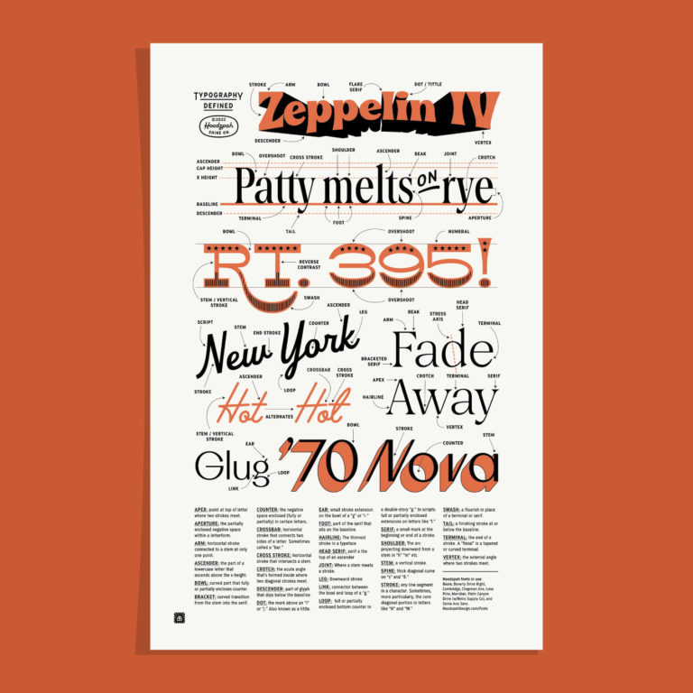
| Font Style | Conveys tone (e.g., serif = tradition, sans-serif = modern) | Choose based on message and audience |
| Font Size | Influences readability and hierarchy | Use larger sizes for headlines |
| Letter Spacing | Affects clarity and mood | Adjust for legibility and style |
| Color | Evokes emotions and draws attention | Contrast with background for visibility |
Key Psychological Principles in Typography
1. Emotional Resonance
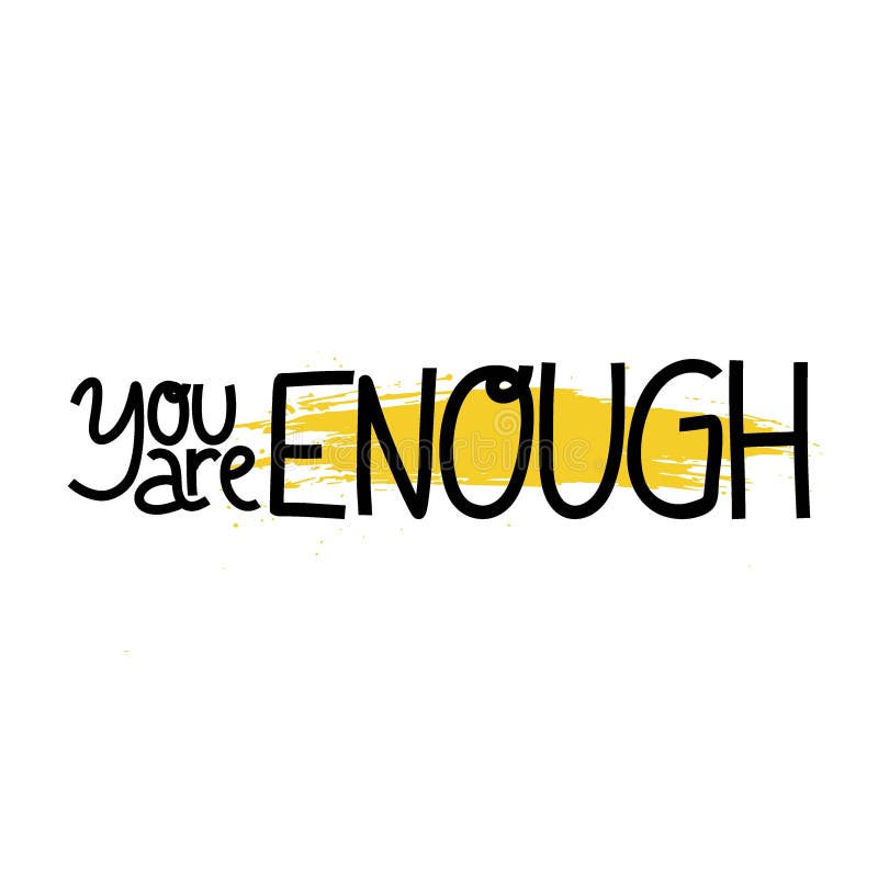
Different fonts evoke different feelings. For example, script fonts can feel elegant or romantic, while bold, blocky fonts may feel strong or urgent.
2. Readability and Cognitive Load
Clear typography reduces cognitive effort, making it easier for viewers to process information quickly. Overly complex fonts can hinder comprehension.
3. Visual Hierarchy
Typography helps establish a hierarchy, guiding the viewer’s eye through the poster in a logical order, from the most important information to the least.
4. Cultural Associations
Fonts carry cultural meanings; for instance, Gothic fonts might evoke historical or traditional themes, while minimalist fonts suggest modernity.
Practical Tips for Using Typography in Posters
- Match font style to message: Align your font choice with the tone of your content.
- Limit font variety: Use no more than two or three fonts to maintain cohesion.
- Use contrast effectively: Combine different weights and sizes to create emphasis.
- Consider spacing: Proper kerning and line spacing improve readability.
- Test for legibility: View your poster from different distances and devices.
FAQ
Q1: How many fonts should I use in a poster design?
A: Ideally, limit yourself to two or three fonts to keep the design clean and cohesive.
Q2: Can color in typography affect emotions?
A: Yes, colors can evoke specific emotions and should complement the message and overall design.
Q3: What font types are best for readability?
A: Sans-serif fonts are generally easier to read on screens, while serif fonts work well in print.
Q4: How does typography influence brand perception?
A: Typography helps communicate brand personality and values, influencing how the audience perceives the brand.
By mastering the psychology of typography, designers can create posters that not only look appealing but also communicate messages more effectively and resonate emotionally with their audience.