Typography Rules for Corporate Branding
Typography plays a crucial role in corporate branding, serving as a visual voice that communicates a brand’s personality, values, and professionalism. Effective use of typography can enhance brand recognition, improve readability, and create a cohesive identity across all marketing materials.
Why Typography Matters in Corporate Branding
Typography is more than just choosing a pretty font; it shapes how customers perceive a brand. Consistent typography helps build trust and ensures that the brand message is clear and memorable.
Key Typography Rules for Corporate Branding
| Rule | Description | Example |
|---|---|---|
| Consistency | Use the same fonts and styles across all platforms to maintain brand unity. | Using Helvetica Neue for all headings and body text in print and digital media. |
| Legibility | Choose fonts that are easy to read at various sizes and on different devices. | Sans-serif fonts like Arial or Open Sans for body text to ensure clarity. |
| Hierarchy | Establish a clear typographic hierarchy to guide the reader’s eye through the content. | Larger, bold fonts for headings; smaller, regular fonts for body text. |
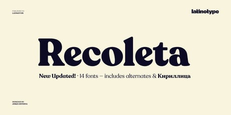
| Brand Personality | Select fonts that reflect the brand’s character—modern, traditional, playful, or serious. | A tech company might use sleek, modern fonts; a law firm might choose classic serifs. |
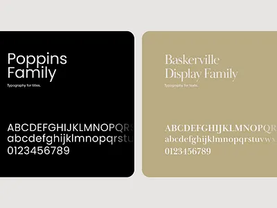
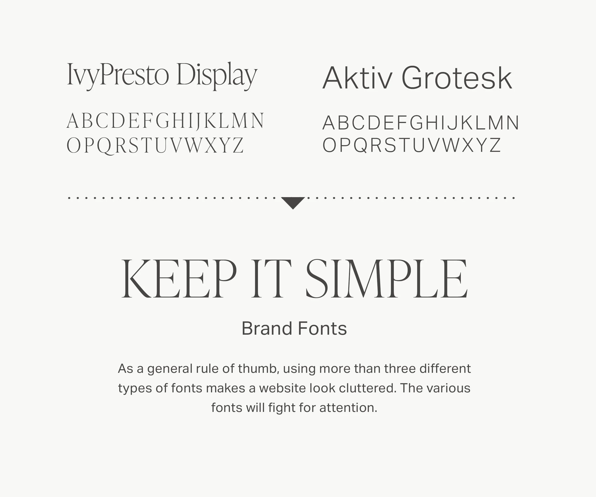
| Limit Font Families | Restrict the number of font families to two or three to avoid visual clutter. | Combining a serif font for headings with a sans-serif for body text. |
| Color and Contrast | Use brand colors thoughtfully to enhance readability and brand recognition. | Dark text on a light background or vice versa for maximum contrast. |
Best Practices for Implementing Typography
- Create a Typography Style Guide: Document font choices, sizes, weights, and usage rules.
- Test Across Mediums: Ensure fonts look good on print, web, and mobile.
- Use Web-Safe Fonts: For digital branding, select fonts that are widely supported.
- Avoid Overstyling: Limit the use of italics, underlines, and all caps to maintain professionalism.
FAQ: Typography in Corporate Branding
Q1: How many fonts should I use in my corporate branding?
A: Ideally, limit your typography to two or three font families to maintain a clean and cohesive look.
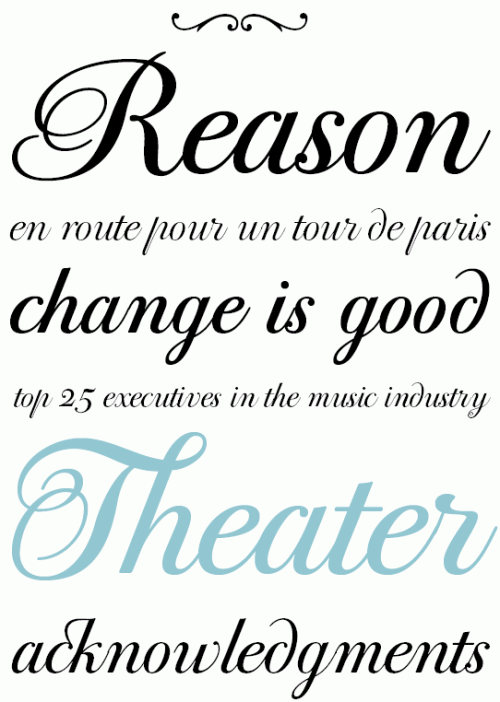
Q2: Can I use decorative fonts for my brand?
A: Decorative fonts can be used sparingly for logos or headings but should not be used for body text due to readability concerns.
Q3: How important is font size in branding?
A: Font size is critical for establishing hierarchy and ensuring readability across different devices.
Q4: Should typography be consistent across all marketing materials?
A: Yes, consistency in typography reinforces brand identity and builds trust with your audience.
Conclusion
Mastering typography rules is essential for creating a strong corporate brand identity. By following these guidelines, companies can ensure their branding is professional, readable, and reflective of their unique personality.
Would you like me to help refine the tone or add more examples to this article? Here are some follow-up tasks you might consider:
- Simplify language for broader audience
- Add case studies on typography use
- Expand FAQ section with more questions