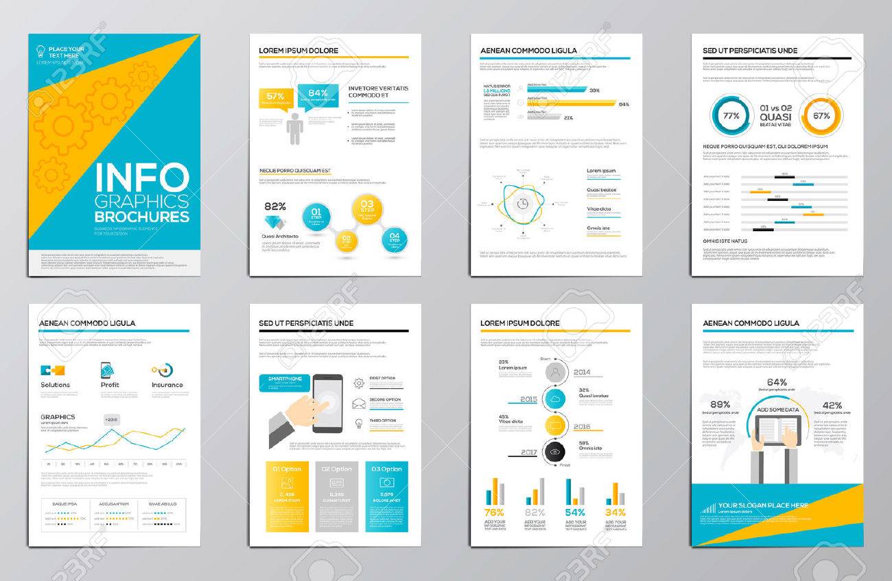
Using Infographics in Brochures: Do’s and Don’ts
Infographics are powerful tools that can transform brochures from plain text-heavy documents into visually engaging and easily digestible content. When used correctly, they enhance understanding, retention, and appeal. However, misuse can lead to confusion or clutter. This article explores the best practices and common pitfalls when incorporating infographics into brochures.
Why Use Infographics in Brochures?
- Simplify Complex Information: Infographics break down complicated data into visual elements like charts, icons, and timelines.
- Increase Engagement: Visual content attracts attention and encourages readers to spend more time with the brochure.
- Enhance Memory Retention: People remember images better than text alone.
- Support Brand Identity: Custom infographics can reflect your brand’s style and tone.
Do’s When Using Infographics in Brochures
| Do’s | Explanation |
|---|---|
| Keep it Simple | Use clear, concise visuals that communicate the message without overwhelming the reader. |
| Use Consistent Branding | Match colors, fonts, and style to your brand guidelines for a cohesive look. |
| Focus on Key Data | Highlight the most important statistics or facts to avoid clutter. |
| Ensure Readability | Choose legible fonts and appropriate sizes; avoid overcrowding elements. |
| Use High-Quality Graphics | Crisp, professional images enhance credibility and appeal. |
| Provide Context | Include brief explanations or captions to clarify the infographic’s message. |
Don’ts When Using Infographics in Brochures
- Don’t Overload with Information: Too much data can confuse readers and dilute the main message.
- Avoid Inconsistent Styles: Mixing different design styles can make the brochure look unprofessional.
- Don’t Neglect Mobile Viewing: Ensure infographics are clear and legible even when the brochure is viewed digitally on smaller screens.
- Avoid Misleading Visuals: Ensure all data representations are accurate and honest.
- Don’t Ignore White Space: Adequate spacing helps prevent clutter and improves readability.
Tips for Creating Effective Infographics
- Plan Your Content: Identify the key message and data points before designing.
- Choose the Right Type: Use charts, graphs, timelines, or icons that best represent your information.
- Use Color Wisely: Colors should enhance understanding, not distract.
- Test with Your Audience: Get feedback to ensure clarity and impact.
FAQ
Q1: What software is best for creating infographics?
A1: Popular tools include Adobe Illustrator, Canva, Piktochart, and Venngage, each offering various templates and customization options.
Q2: How many infographics should I include in a brochure?
A2: It depends on the brochure’s length and purpose, but generally, 1-3 well-placed infographics are effective.
Q3: Can infographics replace text entirely?
A3: No, infographics should complement text by summarizing or highlighting key points, not replace detailed explanations.
Q4: How do I ensure my infographic is accessible?
A4: Use high contrast colors, readable fonts, and provide alternative text descriptions for digital brochures.
Using infographics thoughtfully can significantly enhance your brochure’s effectiveness by making information more accessible and engaging. Remember to balance visuals with text and maintain clarity to create a professional and impactful brochure.